Brand guide
Audiobook Project should feel like a public library, not a startup: plain, calm, trustworthy, and quietly well made.
Principles
- Useful first. Every page is a working tool. The product is the proof; no hero illustrations, no marketing sections.
- Plain, not bland. Ink on paper, one primary action per screen, nothing decorative that doesn't carry meaning.
- Trust through restraint. No hype, no dark patterns, no surprise costs. Say what happens to people's files.
- Built to last. One free, self-hosted typeface, a short list of colors, simple shapes. It should look the same in five years.
Name
Always Audiobook Project: two words, title case. The domain is audiobookproject.org, in lowercase. In running text it's fine to say "the Project" after the first mention.
Never "AudiobookProject", "ABP", "the Audiobook Project app", or a tagline like "Audiobook Project AI". The repository is audiobookproject.
Logo
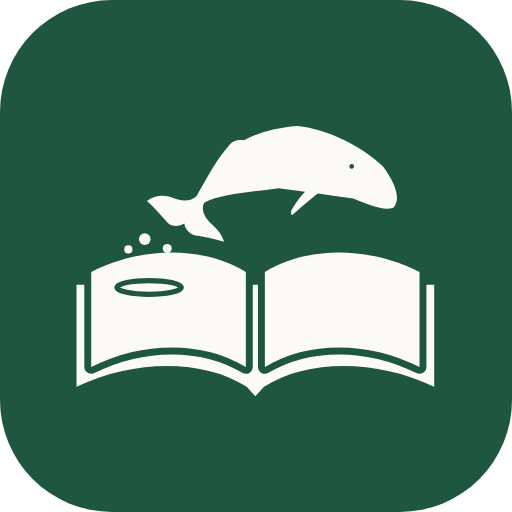
A humpback leaping out of an open book. The pages are the water: it springs from the left page and arcs toward the right, and drops fall from its tail back into the ripple it left behind. It says what the Project does: a story jumping off the page and coming to life.


Construction
- Drawn on a 96 × 96 grid. The whale is one flat humpback silhouette in a gentle arc: long head, a soft hump, a short pectoral fin tucked under the belly, broad notched flukes. One small eye is cut out; no mouth, no outline, no shading.
- The book is an open hardcover: pages on top, the cover showing beneath them, separated by a cut gap. The ripple is a flat ring cut into the middle of the left page, right under the tail.
- Three drops fall between the tail and the ripple, never overlapping the whale or the pages.
- The mark is Library green (
#1F5640) on paper, or paper on Library green or ink. It never takes another color. - The wordmark is Public Sans at 650 with tight tracking (−0.02em). "Project" is set at 500 in the muted ink color.
- Clear space around the logo is at least the height of the whale's head on every side. Minimum size: 16px for the mark, 120px wide for the lockup.
Don't
Seal
A round badge for stickers, social avatars, the donate page and anything printed. It sits beside the logo and never replaces it: the header and the favicon always use the mark.
- The name runs around the top in Public Sans capitals at 600; "Free to all · Est. 2026" runs around the bottom at 400. Two rings, two dots at the sides, the mark in the middle.
- Library green on paper, or paper on Library green. Same rules as the mark: no other colors, no effects.
- Use it at 96px or larger, where the ring text is readable. Below that, use the mark.
Color
Ink on paper. Almost everything is black, white and three greys. Color is reserved for meaning: blue shows progress, green confirms, red warns. Never use more than one of them in the same view, and never as decoration.
Generated book covers are the one place with gentle tints: a muted hue derived from the title (22% saturation, 90% lightness in light mode), with the title in a serif.
Type
Two faces with separate jobs.
- Public Sans is the name: the wordmark and page titles (h1). It was made for U.S. government websites, so it reads as public, plain and trustworthy, and it gives the name the same shape on every device. It's free (SIL Open Font License) and self-hosted from
/fonts, so pages never call another server. - The system font runs everything else: San Francisco on Apple devices, Segoe on Windows, Roboto on Android, Inter as the fallback. Buttons, labels, body copy and section headings. It loads instantly and feels native everywhere.
The only serif is book text: the voice samples and generated covers, set in the device's own serif.
Title · Public Sans 34/650 · −0.025emTurn any EPUB into an audiobook.Lede · 17/400 · Ink 2Upload a book, choose a voice, and start listening.Body · 15/400Narration keeps going if you close this page.Label · 13/600 · Ink 2Your booksHint · 13/400 · Ink 3About 9 h 40 min of audio · 89,412 wordsSentence case everywhere except the name. Numbers use tabular figures where they change (timers, progress).
Layout and components
- One column, 680px wide, generous top space. Content is separated by hairlines, not boxed in cards. One bordered panel per screen at most.
- One primary button per screen, in ink. Everything else is a secondary button or a plain text link.
- Icons are 1.75-stroke outlines with round caps, 18px. No filled icon sets, no emoji in the interface.
- Corners: 9px on buttons and inputs, 14px on panels, round on play buttons. No drop shadows except the floating player's blur.
- Motion is functional only: progress, spinners, a 120ms hover fade.
Voice
Write like a helpful librarian: short, specific, calm. Say exactly what will happen. Prefer real numbers to adjectives.
Do
- "About 9 h 40 min of audio"
- "You can close this page. Narration keeps going."
- "This book is DRM-protected, so it can't be converted."
- "Free" when it's free, with no asterisk.
Don't
- "Unleash the power of AI narration ✨"
- "Revolutionary", "seamless", "magic", "effortless"
- Urgency, countdowns, or fake scarcity
- Exclamation marks in interface copy
Downloads
- mark.svg: the mark alone, in
currentColorso it takes the surrounding text color. - icon.svg: paper mark on a Library green tile, for favicons and app icons.
- icon-512.png and icon-180.png: PNG versions for platforms that need them.